Recently I had the pleasure of working with Hassan Rahim on Geordie Wood’s new website.
It was fantastic. Working with Hassan’s clean, intelligent designs for a man who’s photographed the greats — from Obama to Gucci Mane — was an inspiration. Hassan’s attention to detail is immense and after his carefully labelled Dropbox folders and intensely annotated Invision boards I may never be happy to go back to the ubiquitous, industry standard PDF…
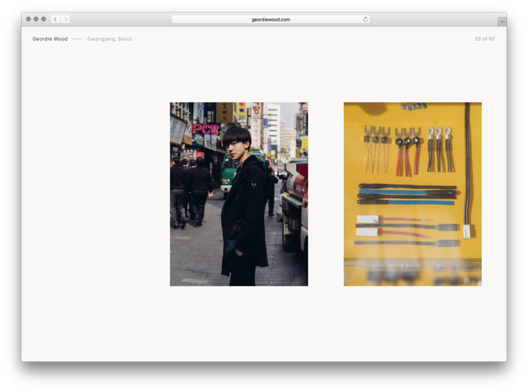
There were three main requirements for the project; a near instantaneous front end with the highest possible visual fidelity and an easy to use backend.
Now, these may seem fairly obvious requests for a photographer’s portfolio site but they’re not as common as you’d expect so here’s a little about how I went about it.
Starting with the frontend, working with large images meant I had to be sure I was sending correctly sized files to each and every client. Previously I’d resize the images on upload to the CMS, but this slows down the editing process and leaves me with just a few sizes to choose from.
So this time I turned to Imgix, and all I had to do was point it to an Amazon S3 bucket and make a request with the filename and dimensions of the image (calculated based on the size the image is to be shown at, the screen size and window.devicePixelRatio). I rounded all sizes to the nearest 50px to make sure I’d hit Imgix’s cache as often as possible, as a cache hit takes only a few milliseconds but with a miss it can be over a second as we wait for Imgix to resize the image before sending it back.
As an aside, I’m only using a few libraries on the frontend — React and React Router are the two big ones — and all my code’s written in what I’ve taken to calling ES6+ (ES6 with a few neat ES7 extras such as async and await) and compiled with Babel.
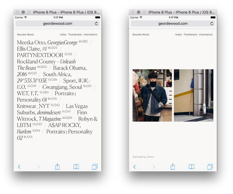
With the image sizes sorted I had to make sure they were loaded as quickly as possible. For the desktop I went with a very aggressive caching strategy that loads all of the slides in the background one-by-one. Though I made sure to take the first slide out of each project and loaded those in immediately so they were ready when the user interacted with the homepage.
For mobile it’s a little different as I couldn’t take the desktop strategy because at best it noticeably slowed things down and at worst it crashed the tab entirely (something that happened a lot on earlier iPads as low internal memory and large images aren’t a good mix). So instead the site waits until the user hits a slide and simply loads in that slide and the one immediately after it. It’s not a perfect solution but it still feels rapid and doesn’t cause any slow-downs.
The backend is very different, while the frontend is rendered almost entirely in the browser the backend is a more typical website. I use Express (I am a member of the organisation and an operator in the IRC channel #express after all), Postgres and a relative newcomer to the Node.js ORM scene: Objection.js. Prior to this I’d been using Bookshelf in all my projects but was increasingly dissatisfied with the way it forces a Backbone-like structure on you and felt that it made too many things (such as validation and nested relations) harder to implement than they should’ve been.
The Objection documentation is also a lot more thorough than Bookshelf’s and an example repo showing you how to write a basic site in ES5, ES6 and ES7 is an added bonus. Seeing as I was compiling everything anyway I took the ES7 route, allowing me to write code like:
router.get('/', async (req, res, next) => {
  const projects = await Project.query().orderBy('position')
  res.render('projects/index', {projects})
})
and:
const project = await Project.query()
  .where('id', +req.params.id)
  .eager(
    '[slides(orderByPosition), slides.images(orderByPosition)]',
    {orderByPosition}
  )
  .first()
(Objection’s eager queries make nested relations absolutely painless)
The main part of the backend is the drag-and-drop slide editor:
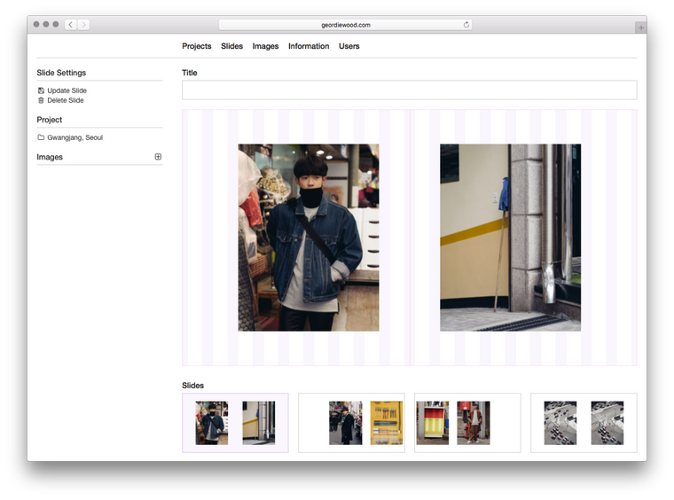
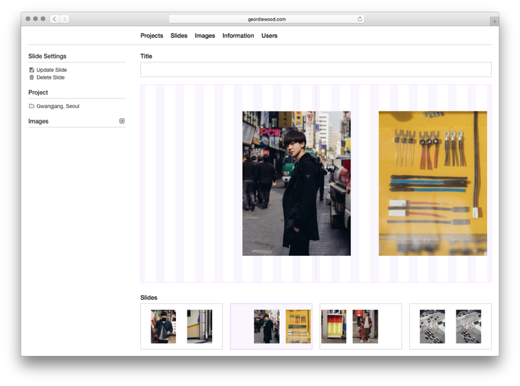
With this Geordie can simply upload images and drag and drop them into the layout grid. They fall where they’re dropped — snapped to the nearest column — and a click can set their width. I used the standard HTML5 drag-and-drop API for this:
const onDragStart = e => {
  const {offsetX, offsetY} = e
  e.dataTransfer.effectAllowed = 'move'
  e.dataTransfer.setData('text/plain', JSON.stringify({offsetX, offsetY}))
}

const onDrop = e => {
  e.preventDefault()
  const {offsetX, offsetY} = JSON.parse(e.dataTransfer.getData('text'))
  // ...
}
The rest is just some maths to figure out which column we’re on and then sending this data to the server. There’s only two fields needed in the database for this; columnsLeft (the column number the image starts at) and columnsWide (the width of the image in columns). Everything else is extrapolated from this and our 16 column grid.
And that’s the majority of it!
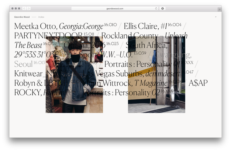
Thanks to Hassan and Geordie for being such a delight to work with, thanks again to Eric Hu for setting me up with them and thanks to the snek team on Slack for helping me brainstorm the best way to lay out the thumbnails.
If you have any questions about this project, or any other projects, get in touch with me via twitter or at ryan@artcommaco.de.